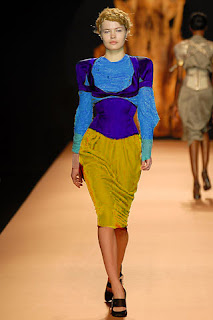
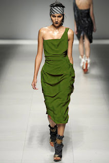
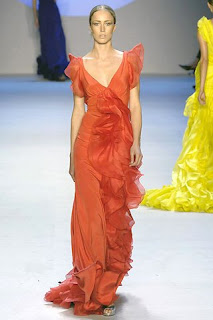
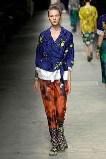
Vivienne Westwood is largely responsible for bringing modern punk and new wave fashions into the mainstream. The artistic exaggerated and volume silhouette of the fashion ever-lasting goes well with all those loud and colors with strong and high shades. It always incorporate youth and street culture but also tradition and technique, its punk meets glam in all their glory.
In the analysis of the color trend in current collections of Westwood, the related color scheme is the most popular in her collections, both related and contrasting. Using of monochromatic hues, changing the value gradually can play throughout the whole collection with various styles even in one piece of her masterpiece. By using 2 to 4 adjacent hues, the analogous color scheme make the whole collection stand out loud and the colors close to each other always nominate the neighbor colors. Besides the related schemes, the single split and triad complementary contrasting color schemes are also prevalent.
My final forecast color trend for Vivienne Westwood is based on the culture and philosophy behind the brand therefore bringing modern punk and new wave elements into my mainstream of the forecasting collection. Owing to the new wave culture is all about the plastic world and was very hip in the 60’s, thus the neon in bright hues in high value is a symbol and remarkable, such as red, orange, blue, green, yellow, purple. Since Vivienne Westwood fashion must be volume silhouette and artistic pieces, and I understand the colors I am going to use in my forecast collection should be match with her unique design. Therefore, I have removed the color of her fashion and filled up my forecast colors in a brand-new way as my final collection.
Strong and bright hues with high value and intensity dominate the new collection. By using the analogous color scheme in one piece of fashion in order to retain softening similarities. As a result, increasing the harmony of the whole collection especially strike a balance to the vigorous hues. Besides, by using monochromatic color scheme that contains only value and intensity variation of one hue, the effect is never dissappointed and rather going well with Vivienne westwood unique style and design.
New wave is all about loud and exaggerated. In order to advance the abundance of color, I have also used the complementary schemes. Since the chosen colors are not dull, therefore simply single split or adjacent complementary schemes is capable to perform the collection.
Black is an evitable hue to pick in the collection. Not only is it the key hue for punk fashion, but also a magic color. Once again, regarding to those high hues and black is an important role here to neutral and balance the overall visual enjoyment of the collection. More important, black does nominates the bright hues to lighten up the collections.
In choosing the appropriate hues to put into a single piece of fashion, I have to understand identical hues can appear different when pairing up with different backgrounds. Thus, it is crucial to create the harmony of color. In order to make the agreement of feeling easier, advancing or receding qualities of hues, values and intensities convey similar moods, giving enough variety for intense but avoiding boredom or conflict. Furthermore, the proportion of color is also very important.
Thursday, November 27, 2008
Tuesday, November 25, 2008
Tuesday, November 18, 2008
From Home Deco to Runway
The colors of house
Both rooms had neutral furnishings, floors and accessories with a bold color on the walls. The bedroom was a blend of warm brown, tans and gray. Everything was a sophisticated blend of neutrals which were beautifully at home surrounded by a mid-tone blue
Subscribe to:
Posts (Atom)


